A brief stock pitch on Colgate with an emphasis on their ESG record.

We represented Concordia University in the Financial Open, Stock Simulation Competition. We pitched Guru, a Montreal-based energy drink company.

An analysis in the merger of UTX and RTN in my Mergers & Acquisitions class.
One of two teams representing Concordia in the regional competitions. We had to write a twenty page research report and then defend our findings in front of a panel of judges.
Report:
PowerPoint Presentation:
Round 1:
Having to choose from a list of companies, we were tasked with writting a two page report. I choose to write about Pembina Pipeline.
Round 2:
The finalists were invited to an ‘analyst day’ where we learned how the CNID equity team conducts long term fundamental analysis. For the second round, we had to pitch a twenty minute presentation in front of the investment committee.
Price/Sales ratios of some healthcare stocks. This illustrates the runaway valuations and high levels of speculation that have occurred since the outbreak in early 2020.
The Russell 3000 Index gets re balanced every year. New stocks are added while under performing ones are removed. I recently read an article explaining how this event could be an opportunity for abnormal returns. When these stocks are added to the index they receive a lot more public attention, and as a result experience a spike in trading volume. The author argues that the best performing additions will continue to outperform the benchmark. I wanted to see if that was the case this year. A good test would be to compare multiple years and the results of the top performing additions to see if this strategy is consistent. Perhaps I will do that sometime in the future. But for now, we will consider the results of 2019.
The new additions are announced on the 28th of June each year. The author argues the optimal results can be achieved by waiting one month after the additions are finalized to determine the top performers. So that’s what I did. Below is a list of the top performing additions along with their percent change over approximately one month.
| Top 25 Performers | |||
| Symbols | 28-Jun | 24-Jul | Percent change |
| INS | 28.79 | 46.74 | 62.34803751 |
| GWGH | 7.14 | 10.21 | 42.99719888 |
| NXTC | 14.98 | 19.22 | 28.30440587 |
| TEUM | 2.61 | 3.3 | 26.43678161 |
| BYND | 160.68 | 202.92 | 26.28827483 |
| BRID | 29.76 | 36.3 | 21.97580645 |
| KRYS | 40.27 | 48.24 | 19.791408 |
| BLFS | 16.95 | 19.89 | 17.34513274 |
| RUBI | 6.36 | 7.39 | 16.19496855 |
| RRTS | 9.55 | 11.05 | 15.70680628 |
| JYNT | 18.2 | 20.99 | 15.32967033 |
| EVER | 13 | 14.84 | 14.15384615 |
| IDT | 9.47 | 10.76 | 13.6219641 |
| PLMR | 24.04 | 27.17 | 13.01996672 |
| DSPG | 14.36 | 16 | 11.42061281 |
| ARES | 26.17 | 29.04 | 10.96675583 |
| APPN | 36.07 | 39.89 | 10.59051844 |
| SONM | 12.73 | 13.98 | 9.81932443 |
| SMAR | 48.4 | 53.1 | 9.710743802 |
| CRK | 5.57 | 6.11 | 9.694793537 |
| GEOS | 15.11 | 16.52 | 9.331568498 |
| APPS | 5 | 5.46 | 9.2 |
| EB | 16.2 | 17.69 | 9.197530864 |
| ACRX | 2.53 | 2.76 | 9.090909091 |
| NG | 5.91 | 6.39 | 8.121827411 |
Below are various comparisons of performance. In the article, the author recommends choosing the top 10, though I recorded the top 25 out of curiosity. What’s interesting is how much better they performed compared to the Russell 3000 in that month: 17.6% vs 2.6% . Also, if I take the average of returns for all the new additions, it comes out as negative. As we can see, just because a stock was added to the Russell, does not mean it will benefit from increased trading volume.
| Comparisons (One month Performances) | |
| Top 10 performers | 27.74% |
| Top 25 Performers | 17.63% |
| Russell 3000 | 2.63% |
| New Additions Average | -5.36% |
Based on the article, the top 10 performing additions will continue to outperform for six months. So I will revisit this and see how they performed six months later.
Here is the Excel file I used:
Sources:
Henning, JD. (2019). Finding Abnormal Returns With the Russell Index Rebalancing Every June. Seeking Alpha. https://seekingalpha.com/article/4268687-finding-abnormal-returns-russell-index-rebalancing-every-june
Russell 3000® Index – Additions (2019). FTSE Russell. https://www.ftserussell.com/resources/russell-reconstitution
A few summers ago I read the book called “Beating the Dow” by Michael B. O’Higgins. He claimed that a simple stock picking strategy involving the thirty Dow Jones Industrial stocks could consistently outperform the market. The “Dogs of the Dow” strategy is to find the ten highest yielding components out of the thirty stocks. With that list of ten, you then choose the five lowest priced ones. With this list of five stocks, you have to wait at least one year to see good performance. The strategy assumes that the lowest priced stocks will not remain so for very long. This is because the Dow Jones Industrial Index of thirty companies represent ‘la crème de la crème’ of the market. Although companies like Walmart and McDonald’s are not monopolies, there is still something special and irreplaceable about these iconic American brands. As a result of the tremendous success of their past, the strategy assumes that any dip these stocks take, is most likely momentary and therefore a good buying opportunity.
Unfortunately the book was a little dated. The data it used was from the 1960’s to the 90’s. I was therefore curious as to whether the strategy would still hold up in the post-Great Recession era.
Performance by Year:
2013:
On December 31, 2013, the highest yielding, lowest priced stocks were Dow DuPont, GE, Intel, Pfizer and Hewlett-Packard. I listed their closing price as of that date. In the next column is the closing price, exactly one year later. I used the sum of the closes to find the total percent change of the entire cohort. In this case, had you bought one share of each, you would’ve had a 34% gain. The bottom chart compares this 34% gain with the percent change of the S&P 500 and the Dow Industrial Index, over the same period. In 2013, the five ‘dog’ stocks outperformed both indexes by quite a bit.
| Closing Prices | |||
| Dogs | Dec.31 2012. | Dec.31 2013. | 1 yr % chg |
| DD | 32.33 | 44.4 | |
| GE | 20.99 | 28.03 | |
| INTC | 20.62 | 25.96 | |
| PFE | 25.08 | 30.63 | |
| HPQ | 6.47 | 12.71 | |
| Sum | 105.49 | 141.73 | |
| 34.3539672 | |||
| Performance Comparison | |||
| Dec.31 2012. | Dec.31 2013. | 1 yr % chg | |
| S&P 500 | 1426.19 | 1848.36 | 29.60124528 |
| DOW | 13104.14 | 16576.66 | 26.49941164 |
| DOGS | 34.3539672 | ||
2014:
| Closing Prices | |||
| Dogs | Dec.31 2013. | Dec.31 2014. | 1 yr % chg |
| T | 35.16 | 33.59 | |
| DD | 44.4 | 46.07 | |
| MRK | 50.05 | 57.64 | |
| PFE | 30.63 | 31.38 | |
| VZ | 30.63 | 47.33 | |
| Sum | 190.87 | 216.01 | |
| % chg | 13.1712684 | ||
| Performance Comparison | |||
| Dec.31 2013. | Dec.31 2014. | 1 yr % chg | |
| S&P 500 | 1848.36 | 2058.9 | 11.39063819 |
| DOW | 16576.66 | 17823.07 | 7.519065964 |
| DOGS | 13.1712684 | ||
2015:
| Closing Prices | |||
| Dogs | Dec.31 2014. | Dec.31 2015. | 1 yr % chg |
| T | 33.59 | 34.41 | |
| DD | 46.07 | 51.48 | |
| GE | 25.27 | 31.15 | |
| PFE | 31.38 | 32.28 | |
| VZ | 47.33 | 46.22 | |
| Sum | 183.64 | 195.54 | |
| % chg | 6.480069702 | ||
| Performance Comparison | |||
| Dec.31 2014. | Dec.31 2015. | 1 yr % chg | |
| S&P 500 | 2058.9 | 2043.94 | -0.726601583 |
| DOW | 17823.07 | 17425.03 | -2.233285287 |
| DOGS | 6.480069702 | ||
2016:
| Closing Prices | |||
| Dogs | Dec.31 2015. | Dec.31 2016. | 1 yr % chg |
| KO | 42.96 | 41.46 | |
| DD | 51.48 | 57.22 | |
| PFE | 32.28 | 32.48 | |
| VZ | 46.22 | 53.38 | |
| WMT | 61.3 | 69.12 | |
| Sum | 234.24 | 253.66 | |
| % chg | 8.290642077 | ||
| Performance Comparison | |||
| Dec.31 2015. | Dec.31 2016. | 1 yr % chg | |
| S&P 500 | 2043.94 | 2238.83 | 9.535015705 |
| DOW | 17425.03 | 19762.6 | 13.41501277 |
| DOGS | 8.290642077 | ||
2017:
| Closing Prices | |||
| Dogs | Dec.31 2016. | Dec.31 2017. | 1 yr % chg |
| CSCO | 30.22 | 38.3 | |
| KO | 41.46 | 45.88 | |
| DD | 57.22 | 71.22 | |
| PFE | 32.48 | 36.22 | |
| VZ | 53.38 | 52.93 | |
| Sum | 214.76 | 244.55 | |
| % chg | 13.87129819 | ||
| Performance Comparison | |||
| Dec.31 2016. | Dec.31 2017. | 1 yr % chg | |
| S&P 500 | 2238.83 | 2673.61 | 19.41996489 |
| DOW | 19762.6 | 24719.22 | 25.08080921 |
| DOGS | 13.87129819 | ||
Yearly Performance Chart:
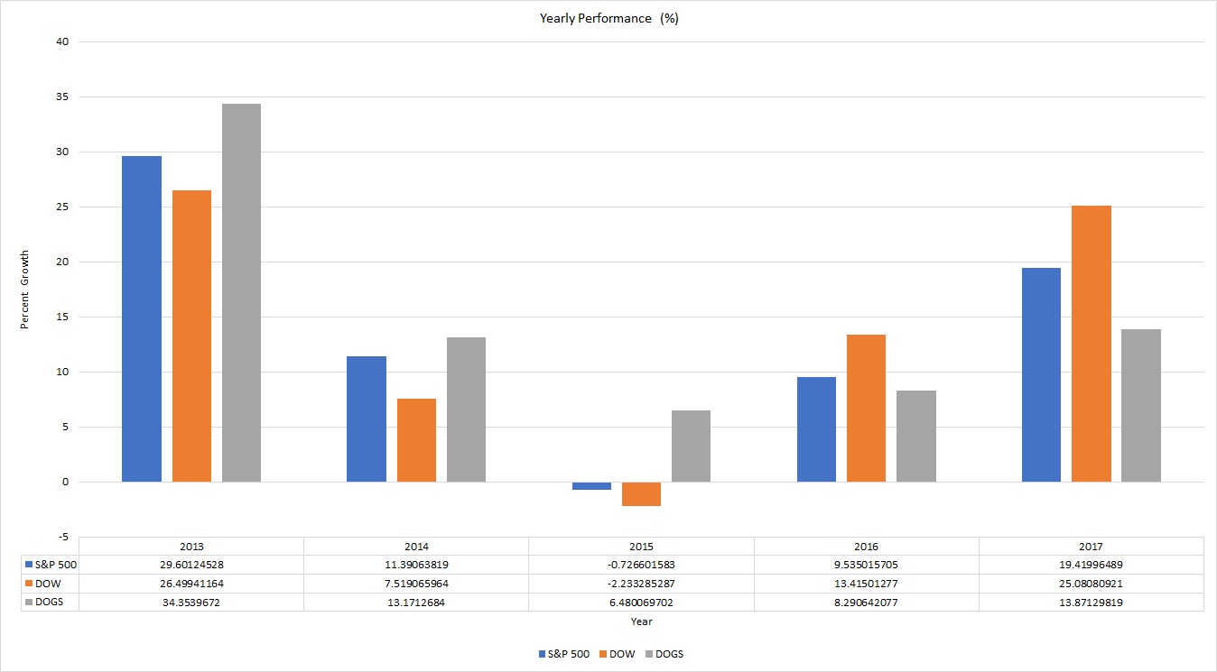
As you can see, the ‘dogs of the dow’ outperformed the S&P and Dow three out of the five years. Interestingly, the dogs of the dow were able to show positive growth in 2015 even when the S&P and Dow declined in that year. The average yearly return (in these past 5 years) for the ‘dogs of the dow” is 15.2%, which is better than the S&P 500 ‘s 13.8% or the Dow’s 14% average yearly return.
If we look at the average yearly return, it’s clear the dogs still outperform the market. What I find interesting though, is that the dogs under-performed the S&P and Dow in the past two years (2016 and 2017). My hypothesis on this is that the recent growth in the market has been mainly attributed to the tech sector. Technology stocks have done extremely well lately and perhaps less capital has been allocated to stable blue-chip dividend stocks (such as those in the dogs of the dow) in favour of more speculative technology names.
Here is the excel file I used to compile the data: